Project
Branding
CLIENT
Bar Monto
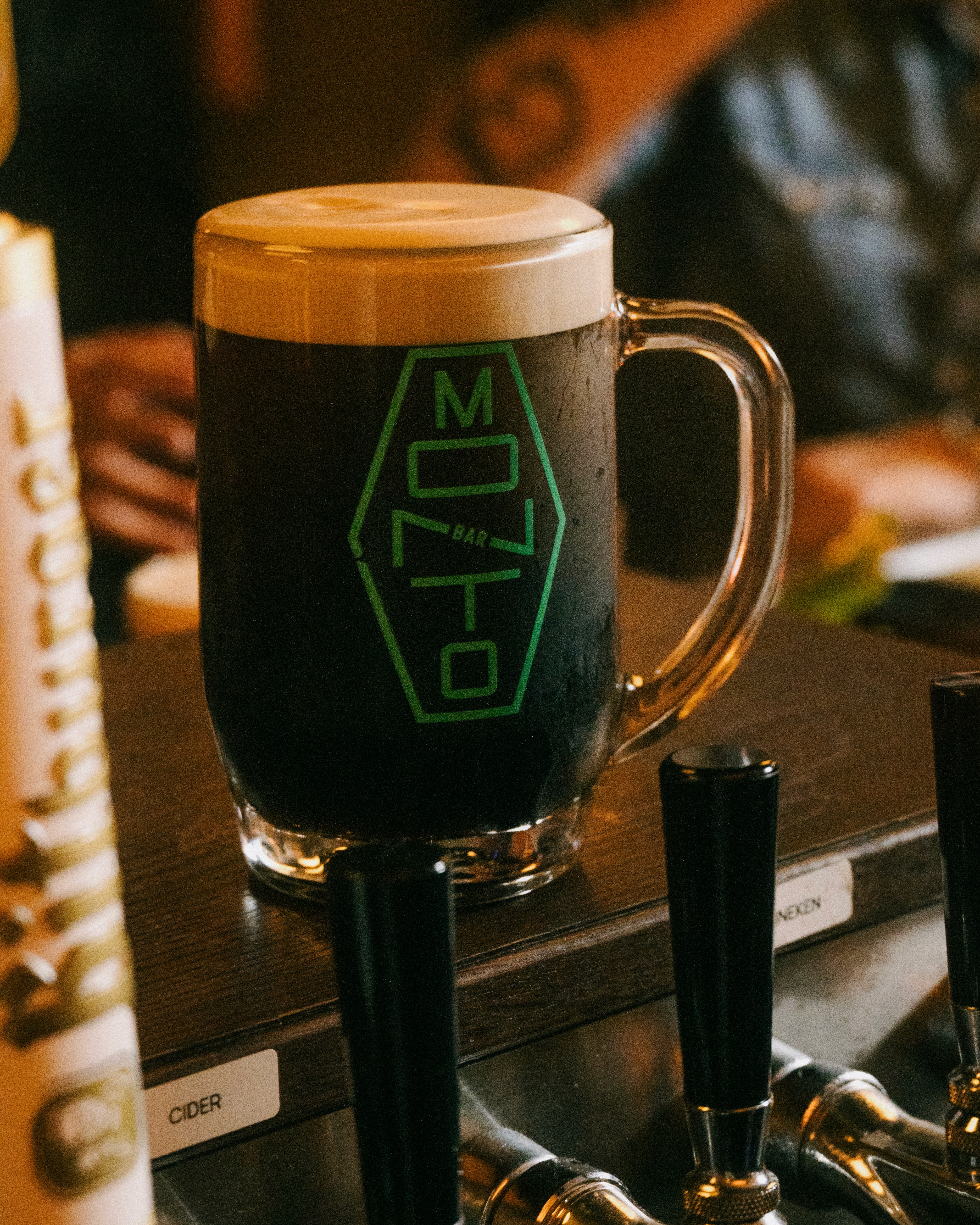
Brand for Bar Monto – a new Irish bar in New York from the kings of East Village, Conor & Archie. The brief was simple: imagine an Irish immigrant arriving in New York in the late ‘80s or early ‘90s, opening a neighbourhood bar with whatever tools they had to hand. The identity had to feel authentic to that moment—but with enough attitude to belong in New York today. The visual language pulls from early desktop publishing, Word glyphs, bitmap graphics, dot-matrix textures and the found fonts you’d have pieced together on an old PC to promote a loft party, rave flyers or late-night disco. Raw, improvised and full of character. The name Bar Monto references Dublin’s infamous Monto district, once the largest red-light district in Europe in the mid 1800s. One of its best-known figures was May Oblong, whose surname became the inspiration for the graphic logo that appears throughout the identity.
Project
Branding
CLIENT
Bar Monto
Brand for Bar Monto – a new Irish bar in New York from the kings of East Village, Conor & Archie. The brief was simple: imagine an Irish immigrant arriving in New York in the late ‘80s or early ‘90s, opening a neighbourhood bar with whatever tools they had to hand. The identity had to feel authentic to that moment—but with enough attitude to belong in New York today. The visual language pulls from early desktop publishing, Word glyphs, bitmap graphics, dot-matrix textures and the found fonts you’d have pieced together on an old PC to promote a loft party, rave flyers or late-night disco. Raw, improvised and full of character. The name Bar Monto references Dublin’s infamous Monto district, once the largest red-light district in Europe in the mid 1800s. One of its best-known figures was May Oblong, whose surname became the inspiration for the graphic logo that appears throughout the identity.
Project
Branding
CLIENT
Bar Monto
Brand for Bar Monto – a new Irish bar in New York from the kings of East Village, Conor & Archie. The brief was simple: imagine an Irish immigrant arriving in New York in the late ‘80s or early ‘90s, opening a neighbourhood bar with whatever tools they had to hand. The identity had to feel authentic to that moment—but with enough attitude to belong in New York today. The visual language pulls from early desktop publishing, Word glyphs, bitmap graphics, dot-matrix textures and the found fonts you’d have pieced together on an old PC to promote a loft party, rave flyers or late-night disco. Raw, improvised and full of character. The name Bar Monto references Dublin’s infamous Monto district, once the largest red-light district in Europe in the mid 1800s. One of its best-known figures was May Oblong, whose surname became the inspiration for the graphic logo that appears throughout the identity.

The name Bar Monto references Dublin’s infamous Monto district, once the largest red-light district in Europe in the mid 1800s. One of its best-known figures was May Oblong, whose surname became the inspiration for the graphic logo that appears throughout the identity.
The name Bar Monto references Dublin’s infamous Monto district, once the largest red-light district in Europe in the mid 1800s. One of its best-known figures was May Oblong, whose surname became the inspiration for the graphic logo that appears throughout the identity.
The name Bar Monto references Dublin’s infamous Monto district, once the largest red-light district in Europe in the mid 1800s. One of its best-known figures was May Oblong, whose surname became the inspiration for the graphic logo that appears throughout the identity.

SIGNAGE & FACADE DESIGN
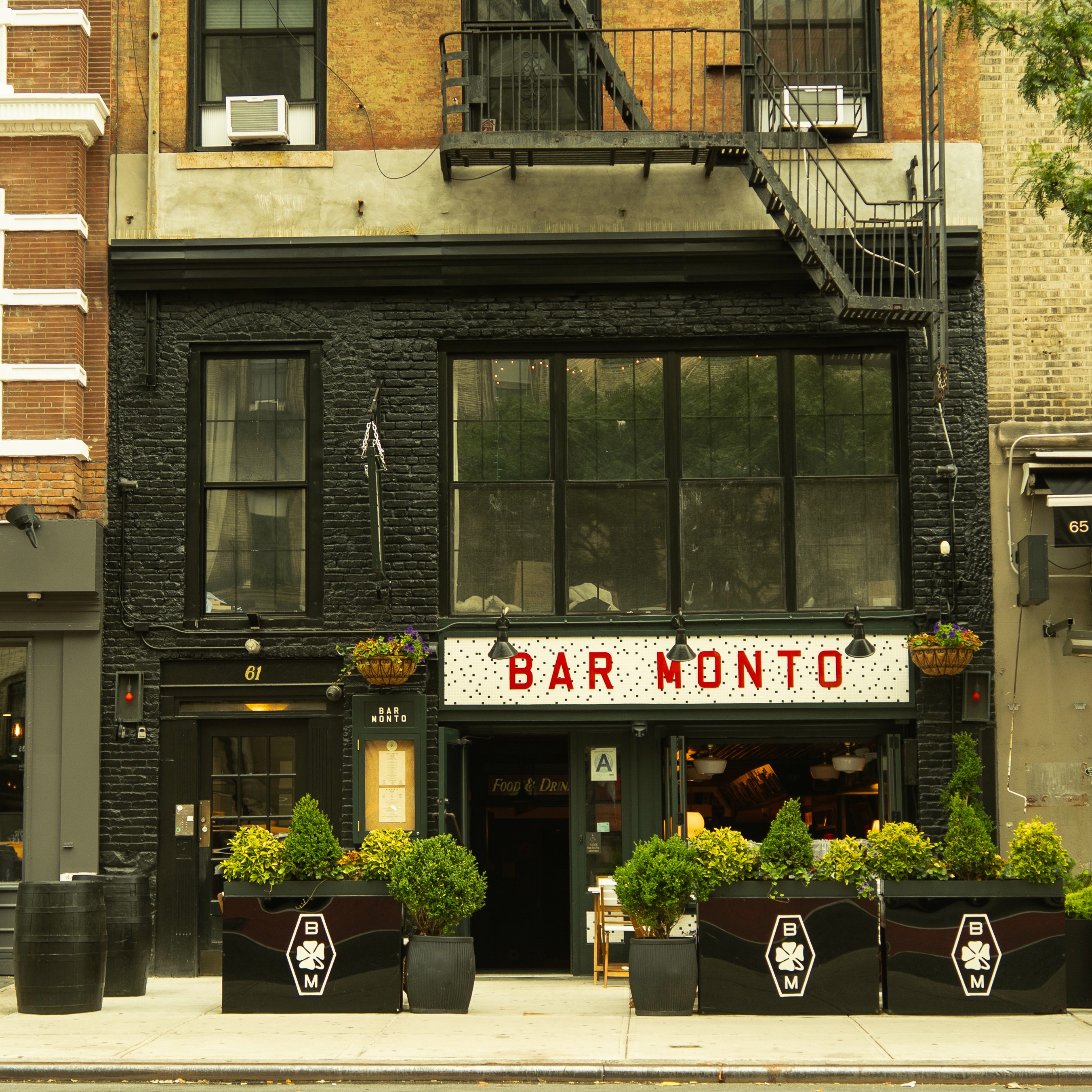
Based on old classic Irish storefronts, featuring a tiled mosaic facade plinth with laser cut perspex type, wooden blade sign and menu board box
SIGNAGE & FACADE DESIGN
Based on old classic Irish storefronts, featuring a tiled mosaic facade plinth with laser cut perspex type, wooden blade sign and menu board box


BRAND CONCEPT
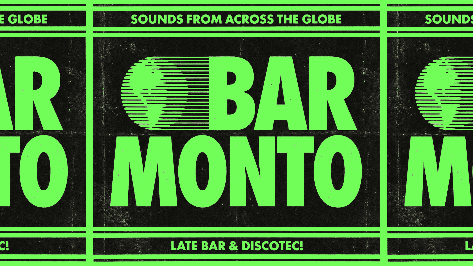
The branding is based on 80s posters for gigs, raves, flyers, loft parties, all with a low-fi, found imagery and bitmap graphics. The idea was how would someone in 1980s NYC design a flyer for a party they were throwing, probably on an outdated machine, printed off and photocopied then plastered around the city.
BRAND CONCEPT
The branding is based on 80s posters for gigs, raves, flyers, loft parties, all with a low-fi, found imagery and bitmap graphics. The idea was how would someone in 1980s NYC design a flyer for a party they were throwing, probably on an outdated machine, printed off and photocopied then plastered around the city.