
Project
Branding
CLIENT
Mo Chara
A Community for Mo Chara, Do Chara & Ár gCairde. Three lifelong friends with the one dream, to open their own pub... This dream became a reality when, in 2021, Cillian, Vincent, and Paul opened the doors of Dundalk’s First Taphouse, Mo Chara. Located in the former ‘Century Bar’, an historic landmark building of the town, this specialised bar and location venue creates a unique experience for the senses, inspired by the world's most iconic taprooms.
Project
Branding
CLIENT
Mo Chara
A Community for Mo Chara, Do Chara & Ár gCairde. Three lifelong friends with the one dream, to open their own pub... This dream became a reality when, in 2021, Cillian, Vincent, and Paul opened the doors of Dundalk’s First Taphouse, Mo Chara. Located in the former ‘Century Bar’, an historic landmark building of the town, this specialised bar and location venue creates a unique experience for the senses, inspired by the world's most iconic taprooms.
Project
Branding
CLIENT
Mo Chara
A Community for Mo Chara, Do Chara & Ár gCairde. Three lifelong friends with the one dream, to open their own pub... This dream became a reality when, in 2021, Cillian, Vincent, and Paul opened the doors of Dundalk’s First Taphouse, Mo Chara. Located in the former ‘Century Bar’, an historic landmark building of the town, this specialised bar and location venue creates a unique experience for the senses, inspired by the world's most iconic taprooms.
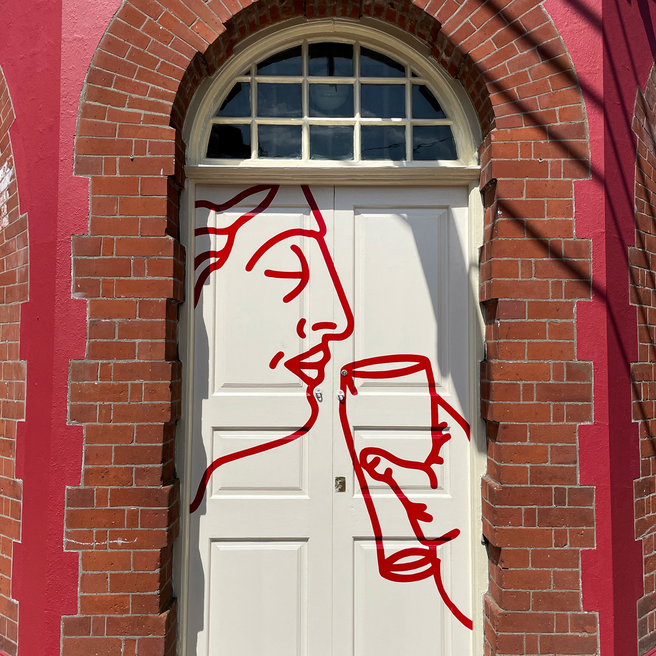
A Community for Mo Chara, Do Chara & Ár gCairde. Three lifelong friends with the one dream, to open their own pub. This dream became a reality when, in 2021, Cillian, Vincent, and Paul opened the doors of Dundalk’s First Taphouse, Mo Chara.
A Community for Mo Chara, Do Chara & Ár gCairde. Three lifelong friends with the one dream, to open their own pub. This dream became a reality when, in 2021, Cillian, Vincent, and Paul opened the doors of Dundalk’s First Taphouse, Mo Chara.
A Community for Mo Chara, Do Chara & Ár gCairde. Three lifelong friends with the one dream, to open their own pub. This dream became a reality when, in 2021, Cillian, Vincent, and Paul opened the doors of Dundalk’s First Taphouse, Mo Chara.
Brand Design Concept
Based around the concept of friendship and unity, we interpreted the Celtic circular symbol for friendship, to create a “Grecian, Wildean eternal circle of pint drinking” motif for the brand identity.
Brand Design Concept
Based around the concept of friendship and unity, we interpreted the Celtic circular symbol for friendship, to create a “Grecian, Wildean eternal circle of pint drinking” motif for the brand identity.


Design References
Drawing on the interior and exterior features, from the ornate wooden bar, to the terrazzo flooring dating back to 1902. The colour palette referenced the interior design and architectural features unique to the building.
Design References
Drawing on the interior and exterior features, from the ornate wooden bar, to the terrazzo flooring dating back to 1902. The colour palette referenced the interior design and architectural features unique to the building.


Building
The location itself, an architectural listed building from 1902, as designed by Terrance McDonald, fed into the brand design and inspired us to produce a brand that was complementary to the character and soul of a very historic building.
Building
The location itself, an architectural listed building from 1902, as designed by Terrance McDonald, fed into the brand design and inspired us to produce a brand that was complementary to the character and soul of a very historic building.


The Buachailli Beoir | Beer Boys
Set up by three best mates, Vino, Paul and Cillian, Mo Chara was a dream to own their own pub in Dundalk.
The Buachailli Beoir | Beer Boys
Set up by three best mates, Vino, Paul and Cillian, Mo Chara was a dream to own their own pub in Dundalk.


HAND PAINTING
Commissioning Andrew Greaves to hand paint the signage & wayfinding throughout, along with outdoor spaces, interiors signs, glass and gold leaf areas.
HAND PAINTING
Commissioning Andrew Greaves to hand paint the signage & wayfinding throughout, along with outdoor spaces, interiors signs, glass and gold leaf areas.


typography
Tying together the brand’s Grecian-inspired illustrative elements is the impactful use of Lydian as the identity’s primary typeface, the humanist calligraphic characteristics of which are sympathetic to the architectural features of the taproom. Conscious of not becoming pastiche – and more reminiscent of an Irish tourism spot than a local haunt – the typography is applied with contemporary sensibilities; keeping things simple, accessible and impactful.
typography
Tying together the brand’s Grecian-inspired illustrative elements is the impactful use of Lydian as the identity’s primary typeface, the humanist calligraphic characteristics of which are sympathetic to the architectural features of the taproom. Conscious of not becoming pastiche – and more reminiscent of an Irish tourism spot than a local haunt – the typography is applied with contemporary sensibilities; keeping things simple, accessible and impactful.


Branding
Their solution translates the commutative sense of unity into graphic form with a pint-inspired reinterpretation of the Celtic symbol for friendship – which sees the three founders represented beer-in-hand. The identity is itself a united harmony between illustration, typography and tactility; upholding the charm, impact and emotive resonance of physical brand applications.
Branding
Their solution translates the commutative sense of unity into graphic form with a pint-inspired reinterpretation of the Celtic symbol for friendship – which sees the three founders represented beer-in-hand. The identity is itself a united harmony between illustration, typography and tactility; upholding the charm, impact and emotive resonance of physical brand applications.


Photography
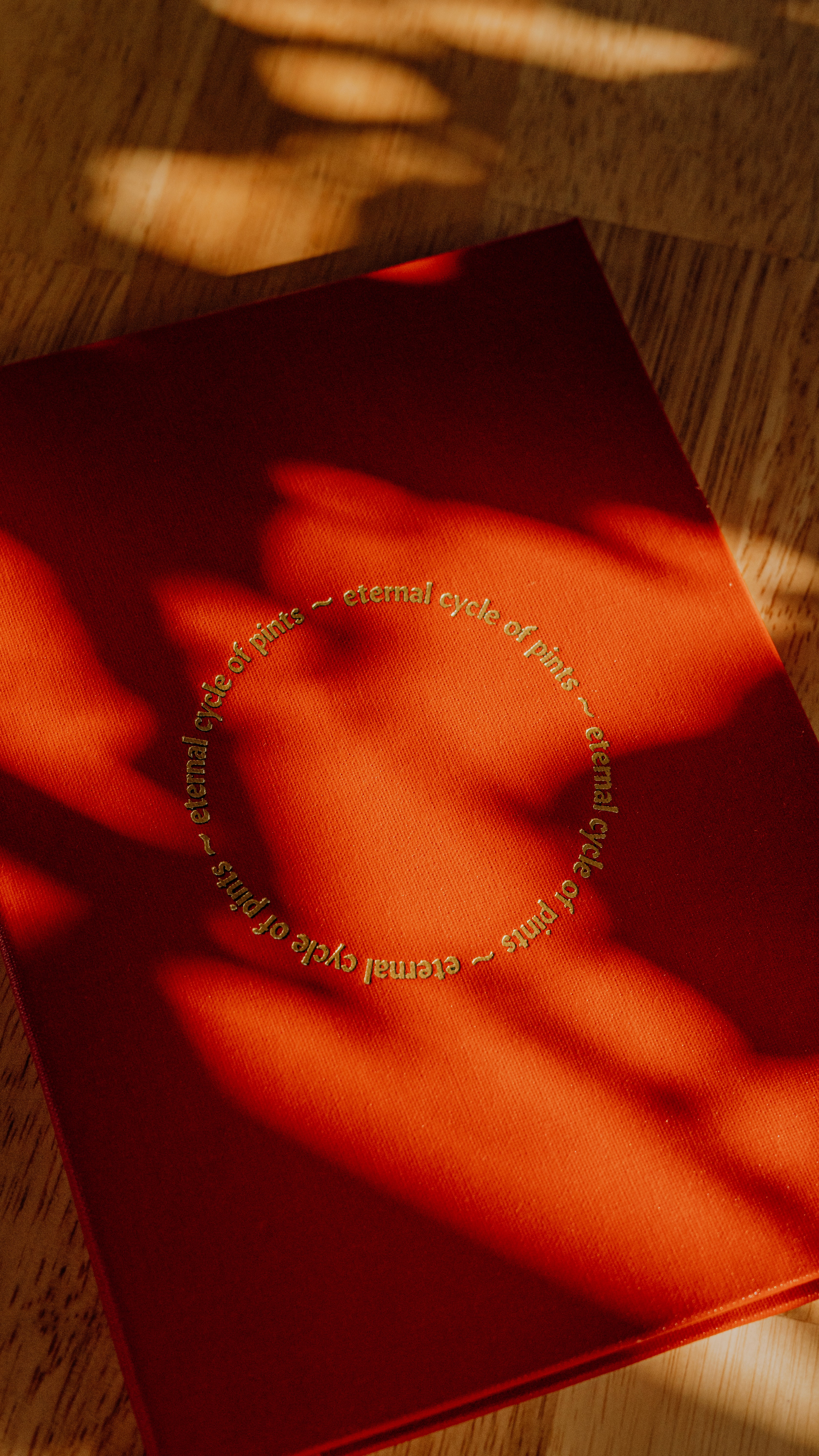
We document every dish & drink Mo's make, across all collabs, events and the monthly menu updates, which includes a new special themed menu each month.
Photography
We document every dish & drink Mo's make, across all collabs, events and the monthly menu updates, which includes a new special themed menu each month.


PRINT DESIGN – MENUS
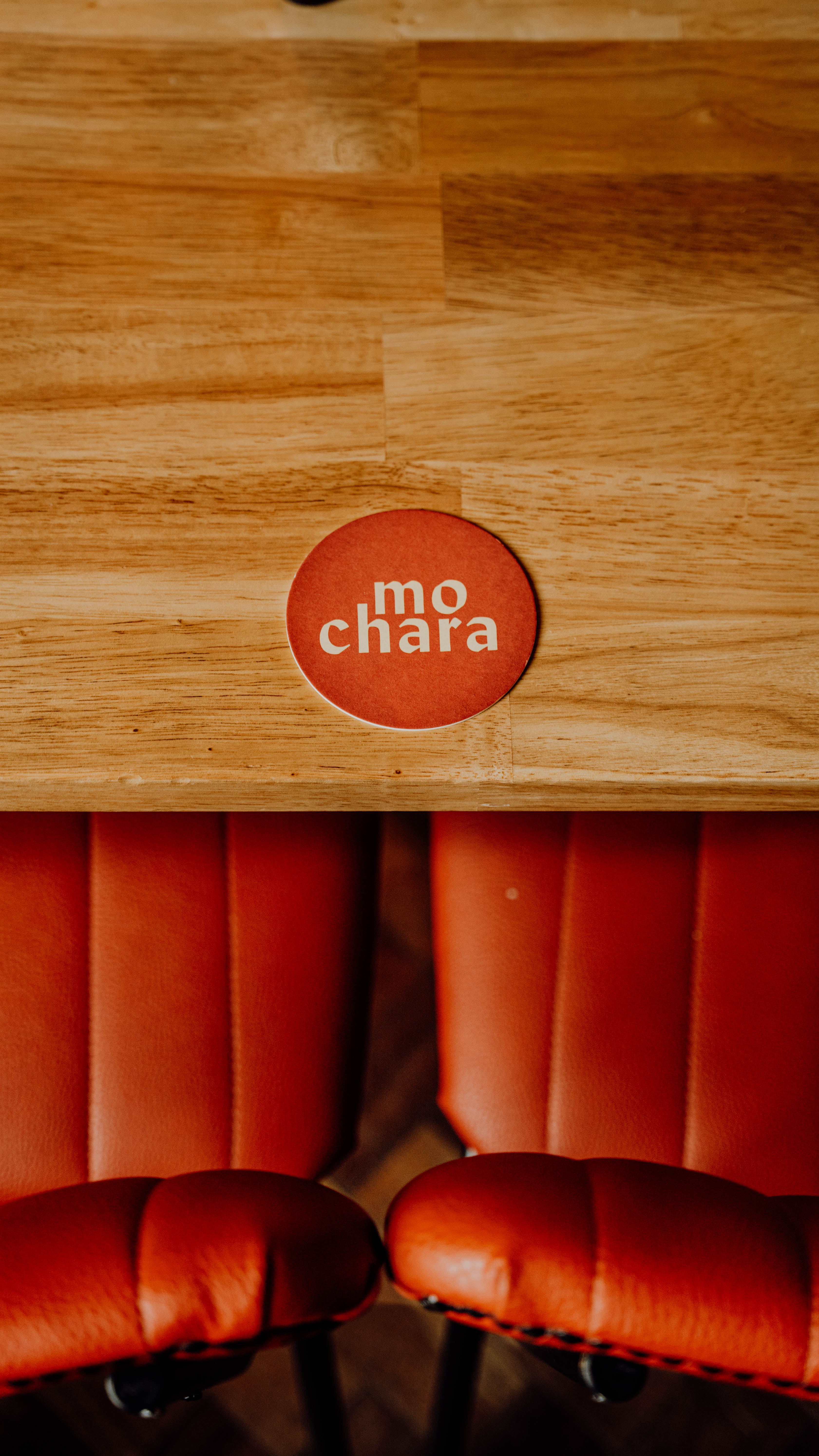
We design each menu for Mo's across all food and drink
PRINT DESIGN – MENUS
We design each menu for Mo's across all food and drink



Photography
We document every dish & drink Mo's make, across all collabs, events and the monthly menu updates, which includes a new special themed menu each month.
Photography
We document every dish & drink Mo's make, across all collabs, events and the monthly menu updates, which includes a new special themed menu each month.

Building
The location itself, an architectural listed building from 1902, as designed by Terrance McDonald, fed into the brand design and inspired us to produce a brand that was complementary to the character and soul of a very historic building.
Building
The location itself, an architectural listed building from 1902, as designed by Terrance McDonald, fed into the brand design and inspired us to produce a brand that was complementary to the character and soul of a very historic building.

ORIGIN
Based around the concept of friendship and unity, we interpreted the Celtic circular symbol for friendship, to create a “Grecian, Wildean eternal circle of pint drinking” motif for the brand identity.
ORIGIN
Based around the concept of friendship and unity, we interpreted the Celtic circular symbol for friendship, to create a “Grecian, Wildean eternal circle of pint drinking” motif for the brand identity.




MO'S DOG CLUB
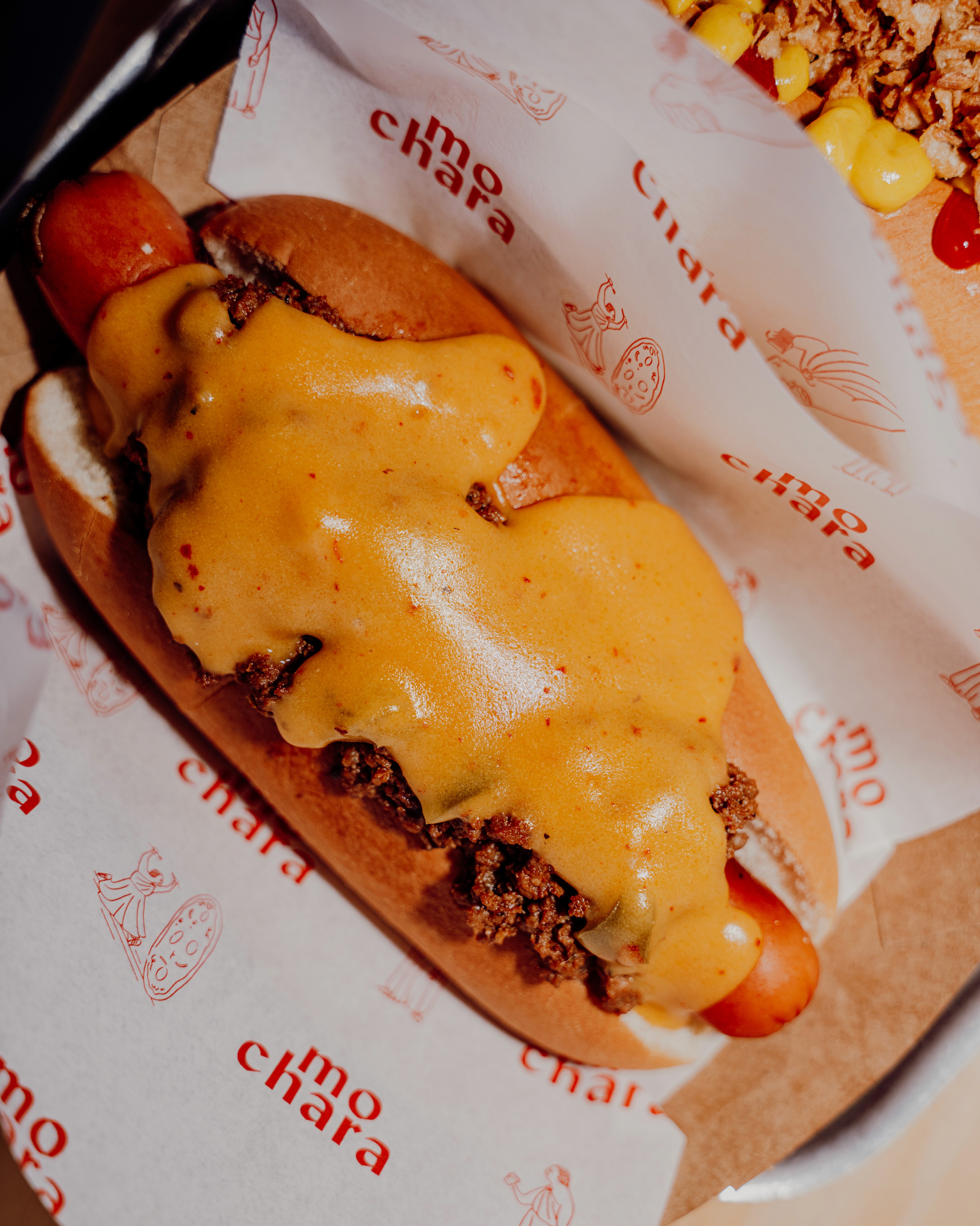
When the Mos lads setup the bar, a portion of their sales went to local dog charities. Water and Puppacinos are still free for all furry friends.
MO'S DOG CLUB
When the Mos lads setup the bar, a portion of their sales went to local dog charities. Water and Puppacinos are still free for all furry friends.

